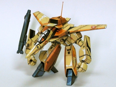
So I'm going to try and paint a mech in a comic book style scheme. You know, the one that makes a 3D model look 2D. Something like this: http://kotaku.com/i-cant-believe-this-i ... 1702763727. Anyway, I'm not skilled enough to do it to this level, but I want to see what I can do. So I need some advice:
I've decided to reduce as many variables as I can, so I'm going to do this in about 5 shades of gray + black (I've got the com-art photo gray set, was thinking of using it with some warm or cool additive, haven't decided which one yet). I'm not sure what shade I should start with. Should I start with the lightest color, or the mid tone? I'm leaning toward the mid tone + black on the accents, then take pictures in the lighting that I want to create to get my reference photos. But I can also see a reason to do the lightest tone + black, then take reference photos. Thoughts?
Thanks,
Dan
Comic style color scheme help.
Moderators: DasPhule, Moderators
- Jonas Calhoun
- Posts: 1919
- Joined: Sun Nov 16, 2003 6:12 pm
- Location: The Hunting Grounds.
Comic style color scheme help.
"Laugh while you can, monkey boy!" -- Lord John Whorfin
Re: Comic style color scheme help.
Hrm...  that could be interesting to see -- a model finishing utilizing Zip-A-Tone...
I had used used Letraset lettering in the past (this was during the days of the 8-bit microcomputer) -- using strips of masking tape and light pencil marks as guides for positioning the lettering directly on the model (only to end up with a headslap moment later when someone commented "why didn't you put the markings on clear decal sheet?")
I had used used Letraset lettering in the past (this was during the days of the 8-bit microcomputer) -- using strips of masking tape and light pencil marks as guides for positioning the lettering directly on the model (only to end up with a headslap moment later when someone commented "why didn't you put the markings on clear decal sheet?")
Naoto Kimura
木村直人
木村直人
Re: Comic style color scheme help.
Tough task. Not an advise on the tones, but you might keep in mind that this "style" also needs a certain perspective to work properly. I'd assume that the 2D effect only works effectively from a single point of view, so you should decide on this first.
My guess would be to apply a white or light grey overall coat of primer to the model, add light from one direction and take pictures from the point of view you want to finish the effect. The picture should give an indication which areas are to shade/emphasize, and I'd also start with a rather light, uniform base color, so that you have room to add lighter highlights.
Another cool effect I have seen and which avoids the perspective issue is a BW or Sepia finish. I have seen this on PVC and action figures, and I can imagine that this would also work on a mech - also involves some shading, but you stay in a single color spectrum and have more options for latre presentation.
DizzyFugu - Reporting from Germany
http://www.flickr.com/dizzyfugu
http://www.flickr.com/dizzyfugu
Re: Comic style color scheme help.
To some extent I would say, take anything you see here about model finishing and ignore it; no washes, no airbrush, no blending. I don't think you have to stick to black and white, although isolating the look might be easier in grayscale (outside of getting the whole thing some solid base color as suggested above). I would suggest instead get a hold of a comic book or manga illustration guide, some specialize in hardware illustration like mecha.
For instance, shading is often done by lines or cross hatching which is something that you would need to do with a fine brush or a paint pen. Highlights are often distinct spots that don't blend Also notice that in comics there is often a limited palette; for instance in B&W there may only black and 1 or 2 more shades of gray plus the white background. Similarly color illustrations also limit themselves to a few distinct colors. Warren Beatty's "Dick Tracy" tried to apply the comic effect to the entire film by only using a handful of colors that were uniformly lit with stark shadows (you can find stills on the net...or you could watch it. It's pretty good IMO).
There was a TAS Enteprise diorama in the SM gallery but I can't find it right now which was done IIRC with very set shades of gray and red and clear black lines which was done to good effect. If I spot it I'll insert the link.
La maquina sobre mi escritorio es una "computadora" del latin "computare", no un "ordenador". El estado de mi escritorio afirma eso. (yo/me)
- Marco Scheloske
- Posts: 5251
- Joined: Sun Jul 14, 2002 11:08 am
- Location: Moenchengladbach, Germany
Re: Comic style color scheme help.
Do a Google picture search for "cell shading model kit". Dozens of very cool inspirational pics will show up.
Re: Comic style color scheme help.
a bit off topic... Nanoblock Monotone colour set
https://www.amazon.com/Kawada-NAN-NB015 ... B00DIYEJLQ
note: Nanoblocks are about 1/2 the linear dimensions of standard Lego.
https://nanoblockus.com/
https://www.amazon.com/Kawada-NAN-NB015 ... B00DIYEJLQ
note: Nanoblocks are about 1/2 the linear dimensions of standard Lego.
https://nanoblockus.com/
Naoto Kimura
木村直人
木村直人
Re: Comic style color scheme help.
I haven't thought of this thread in quite some time. Never did find that TAS diorama (who knows were I saw it originally SM.com, cultvman, ???)
Anyhow following up on Marco's suggestion came up with this excellent example

English article here:https://geekculture.co/macross-robotech ... paint-job/
Original blogpost, http://mumumuno53.blog.fc2.com/blog-entry-97.html
navigating the build posts may be tricky in translation
Anyhow following up on Marco's suggestion came up with this excellent example

English article here:https://geekculture.co/macross-robotech ... paint-job/
Original blogpost, http://mumumuno53.blog.fc2.com/blog-entry-97.html
navigating the build posts may be tricky in translation
La maquina sobre mi escritorio es una "computadora" del latin "computare", no un "ordenador". El estado de mi escritorio afirma eso. (yo/me)
Re: Comic style color scheme help.
A few years ago at Wonderfest, someone made a Superman model with comic book coloring and shading by black lines and crosshatching. It was amazing. No matter what angle you photographed it from it looked like a 2D cutout. I think it won a gold.
